Dolby—
Simplifying an icon


Challenge:
The $7B company specializes in audio noise reduction, audio encoding/compression, spatial audio, and HDR imaging.
The brief was to design a system of symbols that would help create consistency yet flexibility across its wide range of products from digital to physical.
The $7B company specializes in audio noise reduction, audio encoding/compression, spatial audio, and HDR imaging.
The brief was to design a system of symbols that would help create consistency yet flexibility across its wide range of products from digital to physical.


Solution:
The solution required a systems-based approach that could evolve and scale over time. In this case, the SoWhat Approach was used to create a system that was at once recognizable as a Dolby system yet created the flexibility the brand needed to use across all of the ways that we come in contact with Dolby products – from motion-based film to physical products.
The system makes up a powerful visual language consisting of more than 100 individual symbols across a breadth of purpose and tone. They range from the literal to abstract, playful to descriptive, simple to complex; designed to be instantly recognizable yet playful.

The Dolby icons are designed in two different sizes on grids that accommodate various shapes.


The project’s success led Dolby to request the team’s assistance with other projects, including a reevaluation of their corporate headquarters’ experience. The outcome was a supergraphic slated for feature in Fast Company magazine.
A supergraphic at Dolby’s corporate headquarters in San Francisco: You don’t do metal in dobly.

The redesigned Dolby logo.
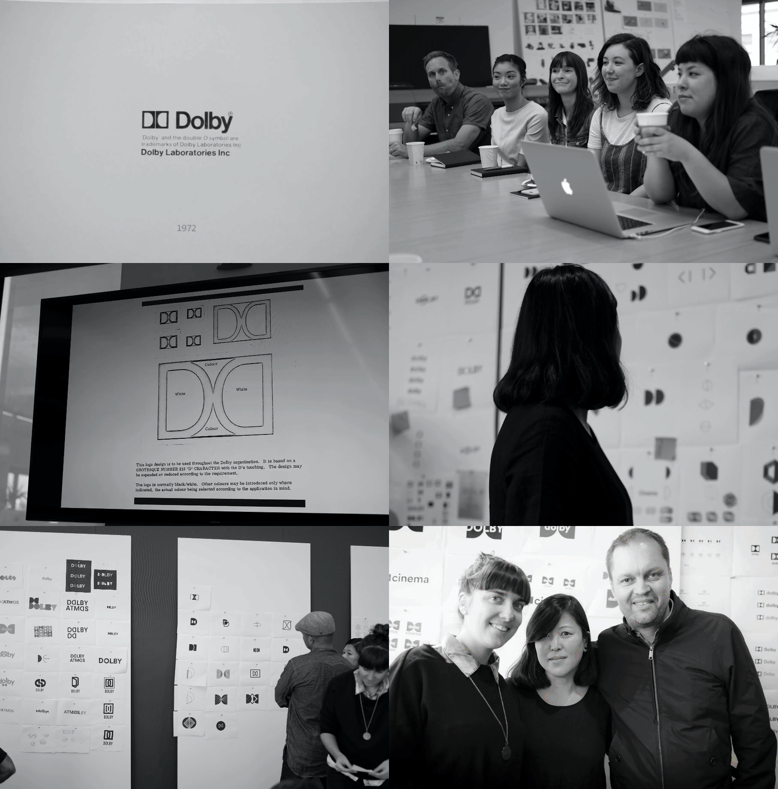
In addition we were invited to direct a brand redesign workshop with Dolby’s internal design team. This event set the course for the redesign of the upcoming Dolby identity.

Team:
Creative Direction, design: Stefán Kjartansson
Designers: Jeff Jarvis & Farbod Kokabi
Intern: Gemma Lindenau
Client team:
Director, Visual Experience: Kevin Byrd
Creative Director: James Ken Butler
Creative Direction, design: Stefán Kjartansson
Designers: Jeff Jarvis & Farbod Kokabi
Intern: Gemma Lindenau
Client team:
Director, Visual Experience: Kevin Byrd
Creative Director: James Ken Butler
See more of the work ︎︎︎
©2023 SoWhat Agency, LLC.
All rights reserved.
